VENTRA KIOSK
Background
It's a project of redesigning current ticket kiosk interface in the CTA (Chicago Transit Authority) stations. The goal of this project is to improve peoples' experience of buying tickets, make them feel no more confuse when standing in front of the CTA ventra kiosk. The redesign doesn't includes screen UI.
Design Process
Interview
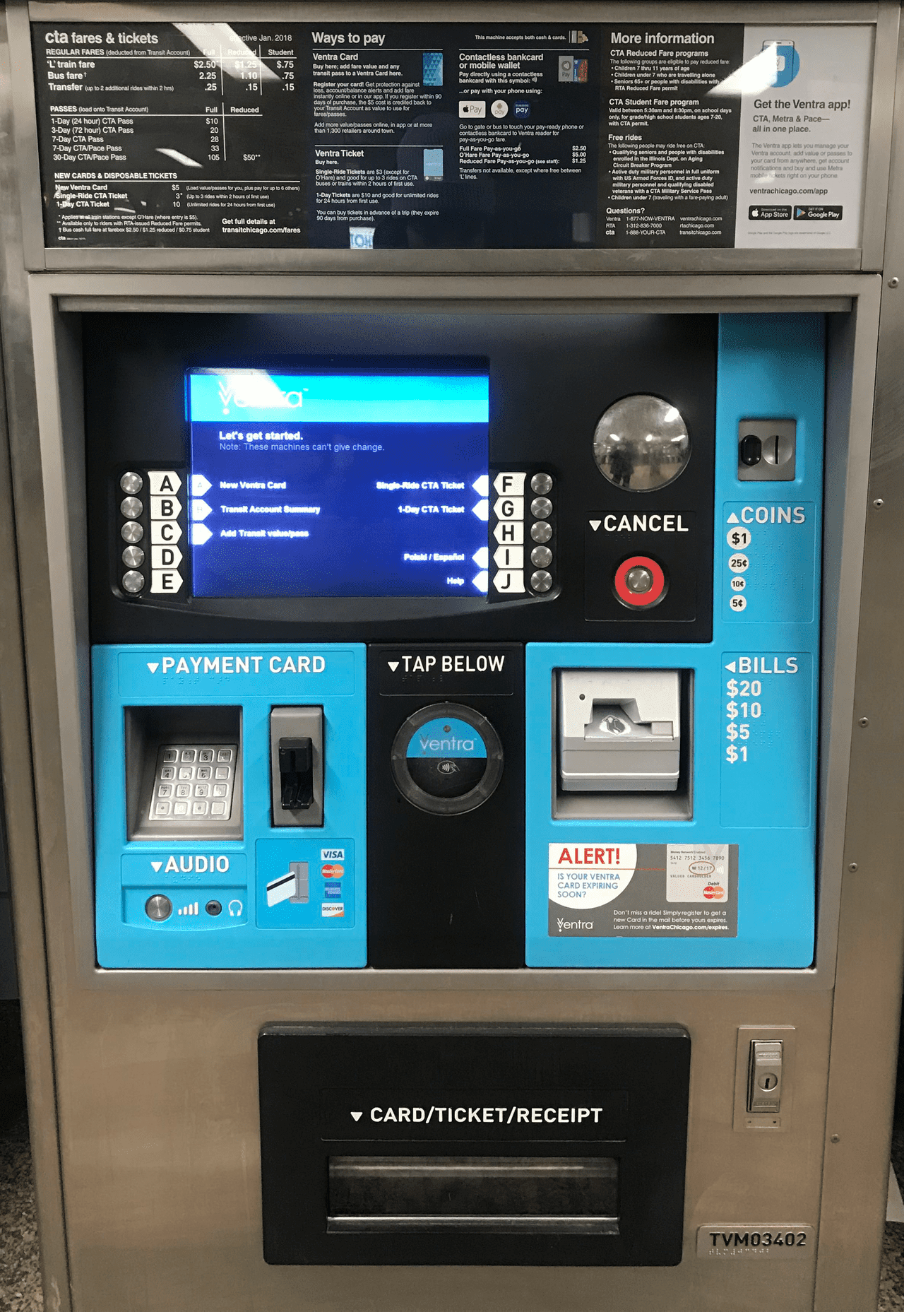
According to my observation and interviewing in the CTA rail station, I found people often feel confuse when manipulating the machine, especially when they need to go to next step. Also, the station stuff said people never read the information on the top of the kiosk. They just ask her for help. Another problem is people sometimes put the credit card into the bill hole.
Problems
PROBLEM 1
The top information section is too crowded and poor organized. People often avoid this kind of thing. When we put too much info together, user see nothing.
PROBLEM 2
In manipulating area, there isn't any flow guidence for people, it makes users take longer time looking around to find where/ what is next.
PROBLEM 3
Without a really obvious differenciation, the bill insert sometimes mix up with card insert.
Analyze Existing Ticket Kiosk
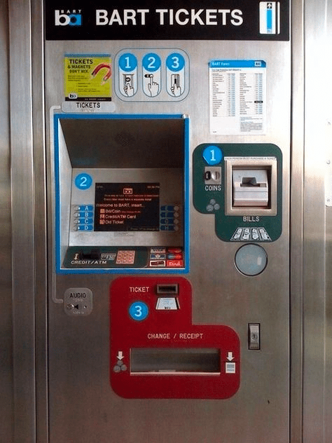
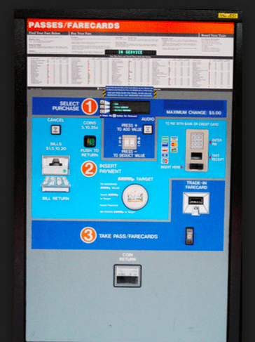
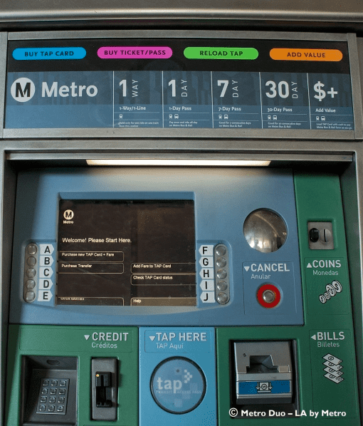
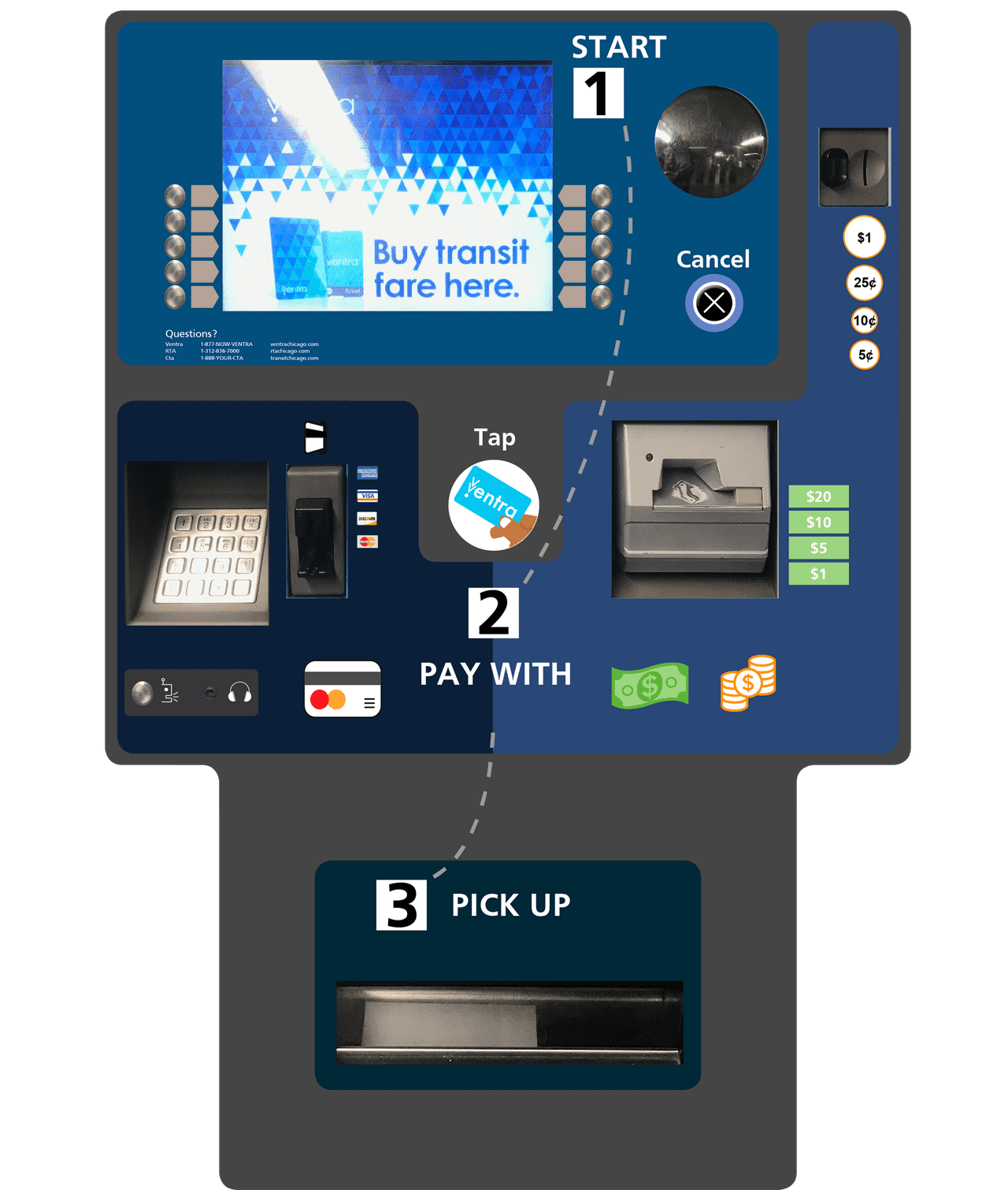
From left to right, both first and second machines are using numbers (1)(2)(3) to guide people. The first one uses strong colors and numbers on three sections, creating a clear process flow. The second kiosk aligns the numbers vertically and uses different blue to distinguish three parts, which is a successfull process flow, too. The last kiosk's manipulating area basically as same as the one I am redesigning. However, it's top information is quite easy to understand, big numbers and clear flow.
Task 1 : Redesign the information section
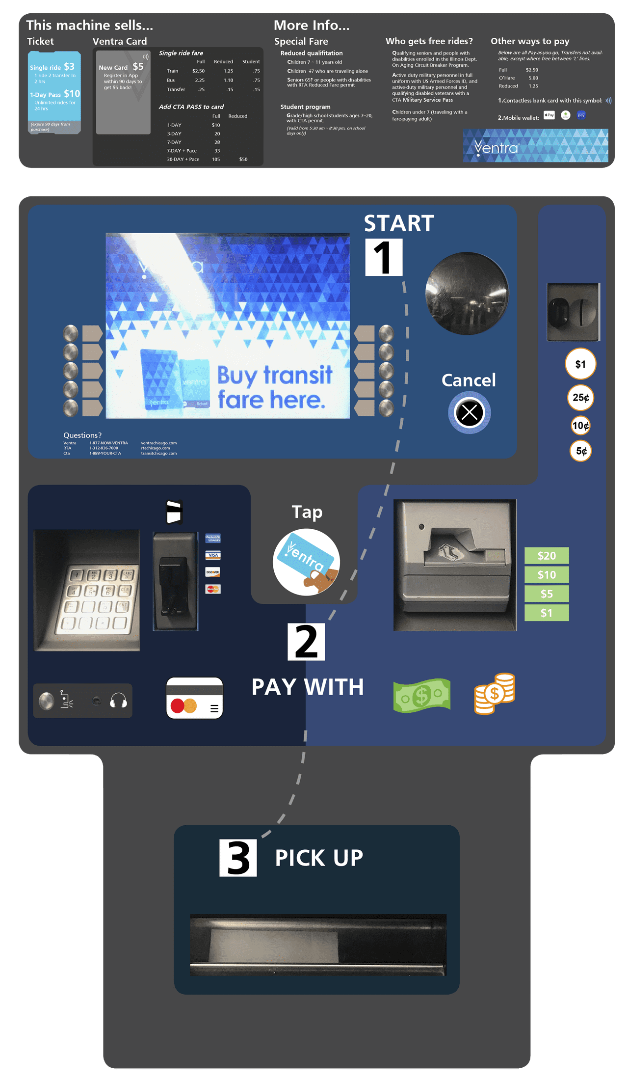
To solve the problem that the information section is too crowded to read, I removed the advertisement section also integrated the fee and ticket block together. People now can understand it much easier. Moreover, I combined image and information together to help people locate where to start and point out the most important info.
Task 2 : Redesign the manipulating section
People often feel confused for next step when they are manipulating the machine. To guide them through the process, I applied reading flow here - orders and dot line lead people across three different sections. Moreover, when users following the dot line to [2] they'll see different types of paying images at both ends of the PAY WITH.
For the problem of mixing bill insert with credit card insert, I replaced texts with images which makes users able to understand at first glance.
